How is the map to be interpreted?
The map displays results of measurements which have been performed within the selected period of time.
Which data are included in the map, depends on the selected settings. In the first combo box, a distinction is made
- on the one hand between "Mobile" (i.e., app in mobile network), "WLAN (App)" (i.e., app in WLAN), and "Browser" (i.e., test is performed in the browser browser without distinction by type of Internet access),
- on the other hand between the quantities to be displayed: download, upload, ping, and possibly signal.
The radio buttons located aside are used to select in which way data should be presented:
- as single points (each point indicating one or more measurements at the same location),
- as a heatmap (several points merged to an area) or
- automatically (single points at high zoom level, heatmap at low zoom level).
The values shown in the map are called quantiles (also called percentiles when using percental representation). An 80-percent quantile means that 80 percent of the values are worse than the quantile and 20 percent better than the quantile ("worse" means lower values for download, upload, and signal strength, and higher values for ping). 50- and 20-percent quantiles are defined accordingly. In simple terms, the 80-percent quantile denotes a value that can be achieved under favorable conditions, the 50-percent quantile (the median) should correspond to typical, the 20-percent quantile to unfavorable conditions. By default, the map displays medians.
Depending on the type selected („Mobile“, „WLAN (App)“, and „Browser“), it is also possible to filter the measurement results of a single mobile or fixed network. By default, the measurement results of all networks are included in the map.
It is also possible to filter by period of time.
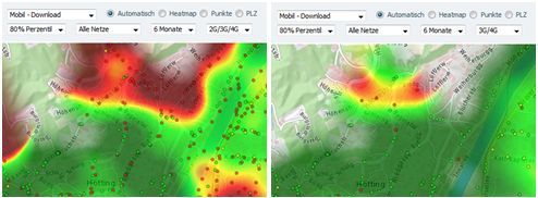
The map should give you an idea which transmission rates are possible in a specific area for specific operators or by using certain equipment. For interpretation, however, it must be noted that different circumstances can affect or even distort the map representation, for example,
- too high or too low frequency of measurements of certain characteristics (e.g., within the network of a particular operator or with a particular device),
- an unusually high frequency of measurements by devices whose throughput is lower than the available bandwidth,
- an ununsually high frequency of measurements in a particular place with particularly good or particularly bad reception conditions (e.g., hiking tour, basement, elevator, tunnel).
Example: Location with above-average number of 2G measurements on the left, compared with 3G/4G-only measurements on the right

The map representation does not mean that in the area X, one might expect an effective transmission rate Z from operator Y. It always refers to a specific selection of measurements, which might have been done under atypical circumstances. It has to be taken into account that the displayed measurement results cannot be achieved for technical reasons for some, in particular older devices.
If no meassurement points are displayed within certain areas this can mean that either no measurements have been carried out at this place or that there might be no signal. Thus it is not a broadband coverage map.
The displayed measurement results can be achieved under favorable, unfavorable or typical conditions depending on the chosen quantile. But it depends on various factors, such as the transfer technology, the device used, the network coverage in the location or of the principles set by the respective contract or tariff restrictions (throttling of download and upload speeds).